Taking advantage of a free trial weekend, I recently spent a couple of days in The Secret World - the new urban fantasy MMO from The Longest Journey creator Ragnar Tørnquist.
I'm not really an MMO guy. I've toyed with Spiral Knights, Rusty Hearts, Fallen Earth and Dungeons & Dragons Online - adding up to a grand total of about fifteen hours - and spent enough time watching friends playing World of WarCraft, EVE Online, EverQuest II and Rift to know that I'm not interesting in trying those myself. Oh, and I was accepted for the Auto Assault beta, but couldn't get the damn thing working.
The setting and the creative director are what attracted me to The Secret World. I adore The Longest Journey and enjoyed its sequel, Dreamfall. The worlds, characters and stories of those games display wit, energy, originality and an impressive level of internal consistency. The Secret World paints with broader brushes, and isn't afraid to borrow elements of other properties, but it's still a well-realised take on the modern fantasy-horror concept. The tropes are put together in a way which is both logical and entertaining, enough that instead of spending my time going "Oh, this bit is like Mage: The Awakening," I was investing directly into The Secret World to a degree I didn't expect. One big YMMV thing to note: the cutscenes are frequent and marathon.
They're well directed and mostly well acted, but my god are they long.
There wasn't much roleplaying going on, which is a shame as a purported strong roleplaying environment was one of the other things which caught my interest. But there was more roleplaying than in
most MMOs, which is to say, there was any roleplaying going on at all.
And at least in a modern setting people talking about other MMOs in the
chat window can be taken as in-character conversation.
That modern setting is well integrated. It's not just a gimmick to make it stand out, although of course, that helps. There are the simple things - energy drinks in place of mana potions, shotguns instead of crossbows - but clever use of the real-world setting goes much deeper, from jumping on cars to set off the alarms to attract zombies, to espionage using webcams mounted on remote controlled helicopters, to an NPC suggestion to look something up on Google. In fact, it may even be too clever at times - I got stuck on one mission, briefly, because I wasn't familiar with a certain element of how church services operate.
I didn't get to do a lot of the much-vaunted investigation missions, which are geared more around codebreaking and old-fashioned adventure gaming than traditional MMO kill/fetch quests, but from what I saw they were well-designed and offer a great change of pace. Indeed, with stealth missions, puzzle-solving missions and even escort missions which don't entirely suck, The Secret World has more variety than any other MMO I've seen. I can't comment on PvP or trading because I did little of the latter and none of the former, but the bread and butter adventuring is solid.
The combat didn't blow my mind but it felt no more or less weighty than any other MMO I've encountered, save perhaps the enjoyably frantic Spiral Knights. It's a little on the 'clicking on things until the health bar hits zero' side of things, but aren't they all? The tactical options didn't seem tremendously deep in my time playing, but I understand that a lot more open up as the game goes on, and they offer a lot of scope for playing your character the way you want to play them. However there's not much visual character customisation (it's mostly punk chicks with blue hair and lots of cleavage, or tough guys in shades) and while there's a lot of skills and abilities, they're all ultimately different lighting effects for doing the same handful of things. The big thing seems to be inflicting and abusing various status ailments, which is interesting, but I'm not convinced about how much depth there is to it for a long game. That said, my main problem with combat and character progression was that to really understand it, you need to have already played the game - again, a common MMO failing.
In fact, most of the things about The Secret World which reminded me of other MMOs were the things I didn't like, the same issues which keep me from enjoying the rest of the genre. The interface is pretty illogical, and in a fashion which means remapping it doesn't help much. It certainly doesn't make any strides towards solving the "requires three hands to play" syndrome ubiquitous to MMOs. One gets used to it, of course, but it took me a while and never really felt properly intuitive. Some elements of the control scheme and menu system aren't explained very well, either.
Overall I must say I quite enjoyed The Secret World - when it worked. Unfortunately the weekend was plagued by server-side connection issues, so much so that the trial period was extended by six hours. There were also a couple of moments of bugged quests, and a driver conflict which wasn't resolved when I updated my drivers. Not a great advertisement, and I have to wonder how happy Funcom and EA are with the free trial given the technical problems which plagued it.
And while I enjoyed The Secret World, I didn't love it. Not enough to pay full price for it when I don't have many friends interested in it, and when things like Spiral Knights and D&D Online are free to play. If it comes down in price, or moves to a microtransaction model, I'd probably take it up. I also think The Secret World would make a great pen-and-paper setting, and perhaps surprisingly I think it would feel quite different to the World of Darkness lines.
Yet I must question the logic of launching a premium-price MMO without a
strong, established IP, and without a standard free trial period, even before you factor in the technical kinks
yet to be smoothed over. Ragnar Tørnquist has a big cult following, but
I don't believe he's someone who can sell a game to a mainstream
audience on his name alone. The marketing campaign has been aggressive,
but it's being marketed in the same way - and in the same places - as
Zynga titles and other free to play games. Will The Secret World
entice people enough that they're willing to drop £40 on it, plus a
monthly subscription? The game has been modestly well-received, with
review scores mostly clumping in the 70% range, but those aren't the kind of numbers to set the world alight.
I'm torn on The Secret World. I want to see it succeed - it's trying new things, and it's bringing a much more interesting approach to storytelling and world building than most MMOs I've seen. But I think it's merely a good game rather than the great game it could be, and that the final leap to greatness won't happen without some necessary negative feedback. Takeup figures aren't out yet - I guess we'll have a better idea of what changes might be made once it's been out a while and the subscriptions stabilise. I have the awful feeling that if it underperforms, EA's solution will be to dial back the elements which make it so unique in a bid to bring it more in line with the field's leaders.
I hope I'm proved wrong there. Selfish as this is - it's not my job on the line - I'd rather see The Secret World as a glorious, ambitious failure than a homogenised, generic hack and slash fest, if that's the choice it comes down to.

Showing posts with label gameworld. Show all posts
Showing posts with label gameworld. Show all posts
Friday, 10 August 2012

Sunday, 15 July 2012
Trailer trash
I wanted to say something about all the Hitman hubbub, but I ultimately had even less to add to that than I did to the Diablo DRM debate. My major issue with the Hitman: Absolution trailer was not one of morality or chivalry, but that it's that it's not Hitman. Hitman is a game about not killing people. That's a very important bit. The part about not drawing attention to yourself, and not turning things into a bloodbath? Being all, like, subtle and stuff, or at least as subtle as one can be for a man with a bardcode on his head? That's what Hitman's about. And an explosive shootout with the cast of Sister Candie Takes The Divine Sacrament* is not subtle. I have subsequently been assured that the Absolution devs disliked the trailer just as much as everyone else, and have promised that the game will stay true to the core of Hitman's heritage.
Would fetish nuns with rocket launchers have caused half as much flap in a trailer for a new Wet or Bayonetta? Well, maybe. Probably. Bayonetta saw a fair amount of controversy surrounding its perceived sexism. But y'know, gender stereotyping aside, that's the sort of thing those games are about. And I salute them for it! That sort of hypersexualised, tongue-in-cheek, over-the-top, crazy-and-deranged-just-for-the-sake-of-it Thing certainly has its place. It's even had its place in Hitman over the years, at least in terms of aesthetic, if perhaps not action. I suppose, in that light, that the rocket launchers bother me more than the fetish nuns.
I've finally gotten round to Saints Row: The Third, and it's practically some kind of golden, penis-shaped temple to debauched lunacy. Yes, all the ladies have pneumatic boobies, and all the men have abs you could bounce rocks off, but that doesn't have to translate to sexist portrayals in terms of personality or societal role. For the most part, SR3 seems to do pretty well there. I'm about as pro gender quality as it's possible to be, but gender equality doesn't mean pretending that sex isn't fun, or that sexuality can't be addressed with a nod and a wink.
And then, there were Duke Nukem Forever's trailers. There's a line between fun, over the top cheese and actual sexism - a wide, blurry line, but some sort of line nonetheless - and DNF smeared rancid, blood-flecked semen all over that line. DNF's trailer made it seem like the game equivalent of the guy who's absolutely convinced that all women are gold-digging whores who need a strong man to keep them in line. That might be part of the same continuum as Bayonetta, but then so is puritanically censoring anything even remotely sexual, and it could be worse than tongue-in-cheek, knowing, over-sexuality.
Assassins attacking 47 in his hotel room, and him having to fight his way out? Sure, I can dig that. Said assassins being an all-female group dressed in latex nuns' habits? Okay then - so far so Tarantino, I guess. Blowing the shit out of the motel in huge explosions? Urgh... I suppose so. The really problematic bit is the fact that Square Enix have decided that this is what they want people's first impression of the new game to be.
Well, the pre-order going up six months ahead of release is also slightly daunting.
A trailer is many people's first window into a game. It's very much a first impression. A preview should get you excited, and displaying that a new installment will be completely different to the previous titles is very risky and rather questionable. The Absolution trailer tells us it will be centred around outlandish action and hyper-stylised sexuality, and that 47 will be an active agent in that this time; longtime fans understand that 47 is an outsider to this sort of thing, and that through his eyes things like fetish nuns with rocket launchers are distasteful. The OTT sexuality and violence of the previous Hitman games weren't presented as something to be celebrated. And of course there's the fact that a game about stealthy assassinations shouldn't need to be marketed on tits and explosions.
In light of the Hitman trailer, there's been a slight resurgence of talk concerning the Tomb Raider reboot's trailers. One of the big problems I've always had with the Tomb Raider series is the fact that Lara Croft is such a monumentally objectionable person. She's blessed with beauty, brains, brawn and fabulous wealth, yet how does she put her good fortune to use? By breaking into sites of historical importance and hoovering up anything valuable while killing the natives and endangered animals residing there. She's basically using her privilege to do whatever she likes, and screw anyone else it might affect. Granted, she finds herself in danger a lot, but she willingly put herself in that position in pursuit of stolen riches. Why, exactly, are we supposed to be sympathetic when she's in trouble? Why do you think 'killing Lara' was such a popular hobby among the PSX generation?
Some games tried to humanise her, or explain her motivations, but it always felt like an awkward retcon to me. Angel of Darkness tried to play up the nasty side of Lara, but it was more like a teenager's concept of 'badass' that true emotional darkness. Lara was always just a fundamentally unlikeable person. The reboot's trailer might not create a likeable protagonist - time will tell - but it's exploring why she is the way she is in a deep, potentially uncomfortable fashion (and I'm not talking about the gratuitous near-rape scene, nor the depressing fact that it's there to make male gamers want to protect Lara).
Most of us have to sympathise, psychologically, with someone who's been through a traumatic experience. But we don't have to like them. That creates an emotional and narrative tension. It's a simple trick, but it works. It was a key element of Analogue: A Hate Story; The Pale Bride went through unspeakable things, but as much as we might feel sorry for her, she's still pretty awful. James Bond went through unspeakable things in the Casino Royale remake, but they don't alter the fact he's an arsehole.
So it is with Lara in the new Tomb Raider trailer. She's beaten, subjected to appalling cicrumstances, and watches her friends get killed. Is that why she becomes the emotionless monster she is in later life? I may very well dislike the new Lara - time will tell - but I feel that there's a good chance I'll dislike her in an interesting way, and not just despise her for being a pantomime murderer. Then again, a lot of gamers have said good things about the old Lara, praising the fact she's a stone cold, unflappable badass. Ick.
Personally, what's gotten me most excited is perhaps the most minimalist preview around. EEEEEEEEEEEEEEEEEEEEEEEEEEEEEEEEEEE!!!!!!!!!!!!!!!!!! Audiosurf Air! Fun fact: Audiosurf is my joint third-most played game on Steam, tied with Psychonauts at 35.6 hours (yeah, it took me that long to complete Psychonauts. Don't... don't ask. I'm ashamed). All that's been revealed of Audiosurf Air is the name and three screenshots, and as the website dryly notes, the graphics are not final and "other things are also not final." But it's enough - there will be a new Audiosurf, and it will not be about fetish nuns with rocket launchers. Score!
I've also been enjoying the videos Stainless put out during their successful Carmageddon Kickstarter campaign. Even compared to Double Fine's videos, the Carmageddon videos are amateurish as hell (one of them features one of the developers dancing around to Trololo for about four minutes, for fuck sake) but I for one actually like that. Nobby and Simista come off as people you could go down the pub with. They're the kind of people I trust with a game like Carmageddon, which was - in essence - a fun pisstake. An accomplished, boundary-rewriting pisstake, but even so.
I wanted to close with something on the previews from Nintendo's new spy-catching game for the 3DS, but... rather embarrassingly.... I can't for the life of me remember what it's called. And this is looking very long and meandering as it is, so I'd better sign off. Bai bai.
*Just be thankful that I couldn't think of a good transubstantiation joke.
Would fetish nuns with rocket launchers have caused half as much flap in a trailer for a new Wet or Bayonetta? Well, maybe. Probably. Bayonetta saw a fair amount of controversy surrounding its perceived sexism. But y'know, gender stereotyping aside, that's the sort of thing those games are about. And I salute them for it! That sort of hypersexualised, tongue-in-cheek, over-the-top, crazy-and-deranged-just-for-the-sake-of-it Thing certainly has its place. It's even had its place in Hitman over the years, at least in terms of aesthetic, if perhaps not action. I suppose, in that light, that the rocket launchers bother me more than the fetish nuns.
I've finally gotten round to Saints Row: The Third, and it's practically some kind of golden, penis-shaped temple to debauched lunacy. Yes, all the ladies have pneumatic boobies, and all the men have abs you could bounce rocks off, but that doesn't have to translate to sexist portrayals in terms of personality or societal role. For the most part, SR3 seems to do pretty well there. I'm about as pro gender quality as it's possible to be, but gender equality doesn't mean pretending that sex isn't fun, or that sexuality can't be addressed with a nod and a wink.
And then, there were Duke Nukem Forever's trailers. There's a line between fun, over the top cheese and actual sexism - a wide, blurry line, but some sort of line nonetheless - and DNF smeared rancid, blood-flecked semen all over that line. DNF's trailer made it seem like the game equivalent of the guy who's absolutely convinced that all women are gold-digging whores who need a strong man to keep them in line. That might be part of the same continuum as Bayonetta, but then so is puritanically censoring anything even remotely sexual, and it could be worse than tongue-in-cheek, knowing, over-sexuality.
Assassins attacking 47 in his hotel room, and him having to fight his way out? Sure, I can dig that. Said assassins being an all-female group dressed in latex nuns' habits? Okay then - so far so Tarantino, I guess. Blowing the shit out of the motel in huge explosions? Urgh... I suppose so. The really problematic bit is the fact that Square Enix have decided that this is what they want people's first impression of the new game to be.
Well, the pre-order going up six months ahead of release is also slightly daunting.
A trailer is many people's first window into a game. It's very much a first impression. A preview should get you excited, and displaying that a new installment will be completely different to the previous titles is very risky and rather questionable. The Absolution trailer tells us it will be centred around outlandish action and hyper-stylised sexuality, and that 47 will be an active agent in that this time; longtime fans understand that 47 is an outsider to this sort of thing, and that through his eyes things like fetish nuns with rocket launchers are distasteful. The OTT sexuality and violence of the previous Hitman games weren't presented as something to be celebrated. And of course there's the fact that a game about stealthy assassinations shouldn't need to be marketed on tits and explosions.
In light of the Hitman trailer, there's been a slight resurgence of talk concerning the Tomb Raider reboot's trailers. One of the big problems I've always had with the Tomb Raider series is the fact that Lara Croft is such a monumentally objectionable person. She's blessed with beauty, brains, brawn and fabulous wealth, yet how does she put her good fortune to use? By breaking into sites of historical importance and hoovering up anything valuable while killing the natives and endangered animals residing there. She's basically using her privilege to do whatever she likes, and screw anyone else it might affect. Granted, she finds herself in danger a lot, but she willingly put herself in that position in pursuit of stolen riches. Why, exactly, are we supposed to be sympathetic when she's in trouble? Why do you think 'killing Lara' was such a popular hobby among the PSX generation?
Some games tried to humanise her, or explain her motivations, but it always felt like an awkward retcon to me. Angel of Darkness tried to play up the nasty side of Lara, but it was more like a teenager's concept of 'badass' that true emotional darkness. Lara was always just a fundamentally unlikeable person. The reboot's trailer might not create a likeable protagonist - time will tell - but it's exploring why she is the way she is in a deep, potentially uncomfortable fashion (and I'm not talking about the gratuitous near-rape scene, nor the depressing fact that it's there to make male gamers want to protect Lara).
Most of us have to sympathise, psychologically, with someone who's been through a traumatic experience. But we don't have to like them. That creates an emotional and narrative tension. It's a simple trick, but it works. It was a key element of Analogue: A Hate Story; The Pale Bride went through unspeakable things, but as much as we might feel sorry for her, she's still pretty awful. James Bond went through unspeakable things in the Casino Royale remake, but they don't alter the fact he's an arsehole.
So it is with Lara in the new Tomb Raider trailer. She's beaten, subjected to appalling cicrumstances, and watches her friends get killed. Is that why she becomes the emotionless monster she is in later life? I may very well dislike the new Lara - time will tell - but I feel that there's a good chance I'll dislike her in an interesting way, and not just despise her for being a pantomime murderer. Then again, a lot of gamers have said good things about the old Lara, praising the fact she's a stone cold, unflappable badass. Ick.
Personally, what's gotten me most excited is perhaps the most minimalist preview around. EEEEEEEEEEEEEEEEEEEEEEEEEEEEEEEEEEE!!!!!!!!!!!!!!!!!! Audiosurf Air! Fun fact: Audiosurf is my joint third-most played game on Steam, tied with Psychonauts at 35.6 hours (yeah, it took me that long to complete Psychonauts. Don't... don't ask. I'm ashamed). All that's been revealed of Audiosurf Air is the name and three screenshots, and as the website dryly notes, the graphics are not final and "other things are also not final." But it's enough - there will be a new Audiosurf, and it will not be about fetish nuns with rocket launchers. Score!
I've also been enjoying the videos Stainless put out during their successful Carmageddon Kickstarter campaign. Even compared to Double Fine's videos, the Carmageddon videos are amateurish as hell (one of them features one of the developers dancing around to Trololo for about four minutes, for fuck sake) but I for one actually like that. Nobby and Simista come off as people you could go down the pub with. They're the kind of people I trust with a game like Carmageddon, which was - in essence - a fun pisstake. An accomplished, boundary-rewriting pisstake, but even so.
I wanted to close with something on the previews from Nintendo's new spy-catching game for the 3DS, but... rather embarrassingly.... I can't for the life of me remember what it's called. And this is looking very long and meandering as it is, so I'd better sign off. Bai bai.
*Just be thankful that I couldn't think of a good transubstantiation joke.
Monday, 7 May 2012
You said no strings could secure you, at the space station [Review: the white chamber]
Studio Trophis' the white chamber was released in 2005, around the time the point-n-click adventure was becoming the genre du jour of the indie scene. Critical reception was positive, but more high profile titles like Yahtzee's Chzo Mythos series and an adaptation of the Bone comic books by new company Telltale Games overshadowed it. I played the white chamber way back when and earlier this year, during my internetless period, I fired it up again. How has it fared in the years since?
A more classic videogame opening there isn't: the protagonist wakes up in a coffin in a sealed room, with no memories - not even of her own name. One simple introductory puzzle and a creepy conversation with a computer panel later, you find yourself alone aboard an abandoned space station. It's dark, it's rusty, and there's a distressing amount of blood encrusted everywhere. It's a claustrophic opening, and it only gets worse as you get the power back on and open up the rest of the complex. Surreal elements, most of them steeped in hellish imagery or twisted body horror, pile up fast. A humanoid knot of pulsating flesh, growing out of the navigation computer, attacks the heroine. A giant eyeball nailed to the wall spins frantically under the glare of a red traffic light seeping congealed gore. Chasms open in the floor, smeared trails of blood appear from nowhere, and dead bodies - or bits of bodies - start showing up at an alarming rate.
The main character finds her mind slipping through this nightmare - although to what extent is debatable. By the midpoint of the game, it's impossible to tell how much of the horror is real and how much is not. For a while, the only answers come from datadisks left behind by a crew member. Eventually, our hero finds her way down into the titular white chamber, and the truth is revealed. The first time I played through this game, a suspicion of the truth behind the nightmare slowly built up in my mind so that I realised it right before the game revealed all, which is the presumable intent; second time around, it all seems pretty obvious from much earlier on, but maybe that's just the benefit of foreknowledge talking.
Either way, the denouement is satisfying, if depressing. That which has gone before is filtered through a new lens - a lens of greed, rage, obsession, betrayal and regret. The previously visceral horror takes on a darker aspect and incidental actions gain sinister alternate significance. For all the dead bodies and loneliness, the white chamber is a game about being alive and being with other people - and the painful ways it can go wrong.
All of the death and decay is presented upfront with few punches pulled. Writhing cadavers, severed limbs, gallons and gallons of blood - it's all there in a grimy, hyperdetailed, hand-drawn art style which heightens the atmosphere using awkward perspectives and off-angle textures. It might seem like it's just badly drawn at first, but as the surreal nature of the game plays out, the bizarre artwork clicks into place, and it works. Lighting takes the form of glowing coloured blocks, adding at once both a classic sci-fi trope and another surreal aspect to the station's twisted design.
The characters are drawn in an 80s-ish manga style, which feels a little out of place - but not mood-shatteringly so, and to be fair, anime is relatively easy to draw and animate for a small, amateur team. The lead character is expressive, and while her voice acting never really evokes the true depths of revulsion and fear she professes to feel, it's good enough not to detract.
What of the game itself? It's short, so within a single day it's easy to attain every possible ending - including the various gruesome deaths awaiting the protagonist. Some actions which seem pointless affect which ending you receive, although the main thrust of the game is not multi-path. Puzzles often follow the same dreamscape logic as the rest of the game; if you struggle with adventure game thinking then the white chamber is probably not for you. If, on the other hand, there seems nothing unusual to you about reassembling a hacked up corpse in the body-shaped grooves on a bed, then you'll do fine.
The puzzling side of the white chamber is pretty unremarkable, in all honesty, neither good nor bad. The way the puzzles tie into the narrative isn't always as tight as it might be, but it's got an interesting take on the old idea of items suddenly becoming interactive when they weren't before. And as I noted in an earlier post, it nails a great balance of usable items being clear without being blatantly obvious.
But the adventuring isn't, in itself, the main reason I would recommend this game. The narrative and twisted imagery, and the atmosphere created, wouldn't work as well in another medium. As with many of my favourites, making the lead's choices induces empathy and that makes the emotional impact all the greater when it comes. Like Assassin's Creed, Braid and Planescape: Torment, and the excellent The Company Of Myself, the white chamber plays with the standard storytelling devices we know and accept in a videogame. It's done more subtly than any of the previously mentioned titles, but it's all the more viscerally affecting for it. To anyone with an interest in games as narrative, and who likes (or can tolerate) adventure games, the white chamber is a fascinating experience.
A more classic videogame opening there isn't: the protagonist wakes up in a coffin in a sealed room, with no memories - not even of her own name. One simple introductory puzzle and a creepy conversation with a computer panel later, you find yourself alone aboard an abandoned space station. It's dark, it's rusty, and there's a distressing amount of blood encrusted everywhere. It's a claustrophic opening, and it only gets worse as you get the power back on and open up the rest of the complex. Surreal elements, most of them steeped in hellish imagery or twisted body horror, pile up fast. A humanoid knot of pulsating flesh, growing out of the navigation computer, attacks the heroine. A giant eyeball nailed to the wall spins frantically under the glare of a red traffic light seeping congealed gore. Chasms open in the floor, smeared trails of blood appear from nowhere, and dead bodies - or bits of bodies - start showing up at an alarming rate.
The main character finds her mind slipping through this nightmare - although to what extent is debatable. By the midpoint of the game, it's impossible to tell how much of the horror is real and how much is not. For a while, the only answers come from datadisks left behind by a crew member. Eventually, our hero finds her way down into the titular white chamber, and the truth is revealed. The first time I played through this game, a suspicion of the truth behind the nightmare slowly built up in my mind so that I realised it right before the game revealed all, which is the presumable intent; second time around, it all seems pretty obvious from much earlier on, but maybe that's just the benefit of foreknowledge talking.
Either way, the denouement is satisfying, if depressing. That which has gone before is filtered through a new lens - a lens of greed, rage, obsession, betrayal and regret. The previously visceral horror takes on a darker aspect and incidental actions gain sinister alternate significance. For all the dead bodies and loneliness, the white chamber is a game about being alive and being with other people - and the painful ways it can go wrong.
All of the death and decay is presented upfront with few punches pulled. Writhing cadavers, severed limbs, gallons and gallons of blood - it's all there in a grimy, hyperdetailed, hand-drawn art style which heightens the atmosphere using awkward perspectives and off-angle textures. It might seem like it's just badly drawn at first, but as the surreal nature of the game plays out, the bizarre artwork clicks into place, and it works. Lighting takes the form of glowing coloured blocks, adding at once both a classic sci-fi trope and another surreal aspect to the station's twisted design.
The characters are drawn in an 80s-ish manga style, which feels a little out of place - but not mood-shatteringly so, and to be fair, anime is relatively easy to draw and animate for a small, amateur team. The lead character is expressive, and while her voice acting never really evokes the true depths of revulsion and fear she professes to feel, it's good enough not to detract.
What of the game itself? It's short, so within a single day it's easy to attain every possible ending - including the various gruesome deaths awaiting the protagonist. Some actions which seem pointless affect which ending you receive, although the main thrust of the game is not multi-path. Puzzles often follow the same dreamscape logic as the rest of the game; if you struggle with adventure game thinking then the white chamber is probably not for you. If, on the other hand, there seems nothing unusual to you about reassembling a hacked up corpse in the body-shaped grooves on a bed, then you'll do fine.
The puzzling side of the white chamber is pretty unremarkable, in all honesty, neither good nor bad. The way the puzzles tie into the narrative isn't always as tight as it might be, but it's got an interesting take on the old idea of items suddenly becoming interactive when they weren't before. And as I noted in an earlier post, it nails a great balance of usable items being clear without being blatantly obvious.
But the adventuring isn't, in itself, the main reason I would recommend this game. The narrative and twisted imagery, and the atmosphere created, wouldn't work as well in another medium. As with many of my favourites, making the lead's choices induces empathy and that makes the emotional impact all the greater when it comes. Like Assassin's Creed, Braid and Planescape: Torment, and the excellent The Company Of Myself, the white chamber plays with the standard storytelling devices we know and accept in a videogame. It's done more subtly than any of the previously mentioned titles, but it's all the more viscerally affecting for it. To anyone with an interest in games as narrative, and who likes (or can tolerate) adventure games, the white chamber is a fascinating experience.
Sunday, 29 April 2012
Tekkit City Chronicles, Vol. 2
A day is a long time in politics, but it's even longer in Minecraft. Two days after I introduced you to our Tekkit server, things had already changed beyond recognition in some places. I'm posting this the day after again, and no doubt when I log back on this evening even more will have changed!


No, really. A lot of arrows.


And a typical interior, showing the bed, running water and electric light. Still to add: food delivery tube, although there was talk of doing that via local shops instead. This room also has a rather stylish sofa, built by Hugh.


It's the Disneyland castle... I mean, Chris' university. The surrounding area will, I suppose, become a campus with student dorms. This is the central building though.


And then laugh at my co-constructors as their hard-built structures get blown up by creepers.
Thursday, 26 April 2012
Tekkit City Chronicles, Vol. 1
Tekkit is a Minecraft client which collates a number of mods, centred around automation and industrialisation. It allows an even greater number of production lines, resource harvesters and redstone circuit powered marvels than base Minecraft, and something my Minecraft group has always mooted is building a fully working industrial city, from the ground up with no creative mode shenanigans.
Now, with Tekkit smoothing over some of the logistical nightmares, we are. This is a large, ongoing project, which has been running about four or five days so far. The basic plan is to provide a city for at least four thousand people, each of whom lives in a private, modestly sized space with at minimum a bed, a running water supply and a food delivery tube. That means we need the infrastucture of farms, warehouses, mines and whathaveyou to supply all of this, and we also want a train network to get us around quickly. Beyond that, we're also adding in "non-functional" buildings and districts like temples and harbours, and depending on how it goes we might include pubs, shops, offices, schools, libraries, museums, council buildings, military holdings, craft and smithy districts...
Obviously, our Rome will not be built in a day.
Our Rome doesn't even have a name yet, although since the initiator of the project is named Hugh, I've taken to calling the city "Hughtopia." For now, most things are named after what they do, or at the whim of the creator. Streets are mostly named after where they lead to, so we have "Temple Road" and the like. I like this - it feels like how a real city develops. "Organically" has been our watchword.
This is where we're at so far.

Welcome to the main area of the city! I know it's not much to look at yet, but one day we'll stand here and talk about how once upon a time all of this was grass and sand dunes.
In the foreground is our power station. Behind it is the front face of the Pantheon, with the bulk of the building apparently lying past the draw distance cutoff. The agricultural area to the left of the power station is probably going to get bulldozed, even though lots of people worked hard on it.
Well, Chris and Abby worked hard on it, anyway. Adrian just bred freakish multicoloured sheep.
The sugarcane plantation on the right will probably be bulldozed too, as already happened to the cactus farm which was once found in this area. The blackish blob on the horizon is our nether portal.

The Pantheon, built by Chris, is the centrepiece of our world. Well, it's actually right at the far edge of the space we're currently using, but still. You can see it from just about anywhere in the city at present.

There's a long approach to the Pantheon from the harbour, along the riverbank and past the nether portal on the right and the sugarcane plantation on the left. The sun rises through the middle arch of the Pantheon, which looks incredible from down this street I'm standing on in the picture.

The interior of the Pantheon - or at least, the main chamber. There's also the antechamber, plus a loft space and a cellar network. The spiral staircase to both the loft and the cellars is cunningly hidden within one of the pillars in this picture.

Inside the power station is this baby: the water pump. It's very arcane and I don't understand any of it, although I did contribute those stylish little steps over the pipes.

Fortunately, Hugh knows how to run it all. There he is now, checking something or fixing something. With a pickaxe.

The empty half of the power station; I started filling in space with this rooftop access stairwell and overseer gantry. The sliver of marble visible on the right is the edge of Adrian's smokestack. Even so, we're left with a ton of free space in here, into which we're thinking of installing the nuclear reactor. Having unstable radionuclides in the same building as the water supply? I don't see how that could possibly go wrong!

A view of the natural harbour which I've claimed as my territory. It was originally intended to be a dockland area, but after discovering that it's in fact not the sea but rather a lake beyond that channel on the left, I'm saving myself a lot of digging by keeping it limited to small boats. Now we're looking at a fishing village, perhaps with a marina. Fortunately, the lake does connect up with the sea somewhere downriver, which is where we'll put the industrial port.

Past the harbour and round the coast, one comes to this lighthouse. The top is currently just lit with a lot of torches; in time, we'll most likely replace that with glowstone-powered electric lights.

As seen from the top of the lighthouse, this little island - the one with the gulley dug through it - needs to be bulldozed to allow access to the harbour. I'm not yet sure what'll happen to the cows who make their home there.
As seen in these screenshots, Tekkit adds coordinates and a minimap, which is I think my favourite thing about it. It's very, very useful not just for general navigation, but for those huge party-dungeoneering trips out, be it for strip mining cobblestone, scouting cavern networks or snatching glowstone formations from the nether - the kind of trip which invariably sees us get lost and/or separated.
Of course, sometimes a minimap isn't enough, and that's where the good people of Minecraft World Map come in handy; as the name suggests, their fancy tech allows you to map your entire world, and in fetching isometric fashion no less. You can follow the progress of our world at this link!
Until next time, happy mining, and may you not dig into a lava floe when you're laden down with precious ores.
Now, with Tekkit smoothing over some of the logistical nightmares, we are. This is a large, ongoing project, which has been running about four or five days so far. The basic plan is to provide a city for at least four thousand people, each of whom lives in a private, modestly sized space with at minimum a bed, a running water supply and a food delivery tube. That means we need the infrastucture of farms, warehouses, mines and whathaveyou to supply all of this, and we also want a train network to get us around quickly. Beyond that, we're also adding in "non-functional" buildings and districts like temples and harbours, and depending on how it goes we might include pubs, shops, offices, schools, libraries, museums, council buildings, military holdings, craft and smithy districts...
Obviously, our Rome will not be built in a day.
Our Rome doesn't even have a name yet, although since the initiator of the project is named Hugh, I've taken to calling the city "Hughtopia." For now, most things are named after what they do, or at the whim of the creator. Streets are mostly named after where they lead to, so we have "Temple Road" and the like. I like this - it feels like how a real city develops. "Organically" has been our watchword.
This is where we're at so far.

Welcome to the main area of the city! I know it's not much to look at yet, but one day we'll stand here and talk about how once upon a time all of this was grass and sand dunes.
In the foreground is our power station. Behind it is the front face of the Pantheon, with the bulk of the building apparently lying past the draw distance cutoff. The agricultural area to the left of the power station is probably going to get bulldozed, even though lots of people worked hard on it.
Well, Chris and Abby worked hard on it, anyway. Adrian just bred freakish multicoloured sheep.
The sugarcane plantation on the right will probably be bulldozed too, as already happened to the cactus farm which was once found in this area. The blackish blob on the horizon is our nether portal.

The Pantheon, built by Chris, is the centrepiece of our world. Well, it's actually right at the far edge of the space we're currently using, but still. You can see it from just about anywhere in the city at present.

There's a long approach to the Pantheon from the harbour, along the riverbank and past the nether portal on the right and the sugarcane plantation on the left. The sun rises through the middle arch of the Pantheon, which looks incredible from down this street I'm standing on in the picture.

The interior of the Pantheon - or at least, the main chamber. There's also the antechamber, plus a loft space and a cellar network. The spiral staircase to both the loft and the cellars is cunningly hidden within one of the pillars in this picture.

Inside the power station is this baby: the water pump. It's very arcane and I don't understand any of it, although I did contribute those stylish little steps over the pipes.

Fortunately, Hugh knows how to run it all. There he is now, checking something or fixing something. With a pickaxe.

The empty half of the power station; I started filling in space with this rooftop access stairwell and overseer gantry. The sliver of marble visible on the right is the edge of Adrian's smokestack. Even so, we're left with a ton of free space in here, into which we're thinking of installing the nuclear reactor. Having unstable radionuclides in the same building as the water supply? I don't see how that could possibly go wrong!

A view of the natural harbour which I've claimed as my territory. It was originally intended to be a dockland area, but after discovering that it's in fact not the sea but rather a lake beyond that channel on the left, I'm saving myself a lot of digging by keeping it limited to small boats. Now we're looking at a fishing village, perhaps with a marina. Fortunately, the lake does connect up with the sea somewhere downriver, which is where we'll put the industrial port.

Past the harbour and round the coast, one comes to this lighthouse. The top is currently just lit with a lot of torches; in time, we'll most likely replace that with glowstone-powered electric lights.

As seen from the top of the lighthouse, this little island - the one with the gulley dug through it - needs to be bulldozed to allow access to the harbour. I'm not yet sure what'll happen to the cows who make their home there.
As seen in these screenshots, Tekkit adds coordinates and a minimap, which is I think my favourite thing about it. It's very, very useful not just for general navigation, but for those huge party-dungeoneering trips out, be it for strip mining cobblestone, scouting cavern networks or snatching glowstone formations from the nether - the kind of trip which invariably sees us get lost and/or separated.
Of course, sometimes a minimap isn't enough, and that's where the good people of Minecraft World Map come in handy; as the name suggests, their fancy tech allows you to map your entire world, and in fetching isometric fashion no less. You can follow the progress of our world at this link!
Until next time, happy mining, and may you not dig into a lava floe when you're laden down with precious ores.
Tuesday, 24 April 2012
More on graphics: mere technicalities
Several months with no internet meant I looked to the retro world even more than usual for my gaming. Or at least, as far as the PC goes, to the older games which would actually run on my new computer - which unfortunately did not include Grim Fandango. Booo! Retuning older games for modern systems is a bandwagon more devs should hop onto. God bless GOG.com and the various console home arcades. But it does mean that, without the web, I've been kinda limited in options.
On the subject of retro: I know I've said this before and I'm sure I'll say it again, but damn is that word irritating. Gamers of the world, I implore you to stop describing old games as retro! Around Christmas time I rewatched It's a Wonderful Life and it's not a 'retro' film. It's just a film. A film which, despite technical limitations in its production compared to modern releases, and the subsequent years' advancement of cinematic techniques and a shifting of the preconceptions of good storytelling, is still every bit as enjoyable as anything you'll see at the pictures this year.
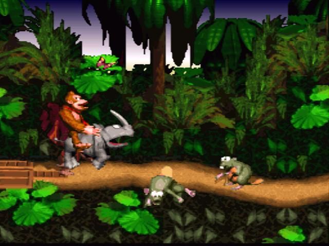
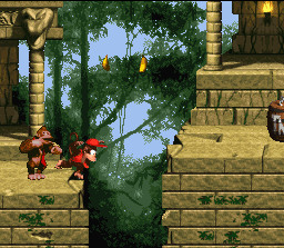
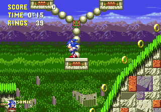
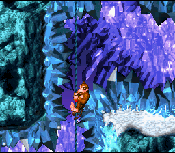
Similarly, despite their technical ineptitude by modern standards, I've been thoroughly enjoying the Micro Machines, Donkey Kong Country and Sonic the Hedgehog series, and the original Grand Theft Auto has lost barely anything despite the advances of its successors. Even ancient Disney tie-in Aladdin was as playable today as it was in 1993. The original Donkey Kong Country is the most revealing game from a technological standpoint - can you believe it was once considered the cutting edge of photorealism? I wonder if the kids of today could even see the difference in quality between its graphics and those of Sonic 3, a difference which seemed so vast to us at the time. Nonetheless, the visuals do everything they need to do to make the game playable, while still looking charmingly pretty in a - sigh - 'retro' sort of way. Maybe the ice cave levels don't make me feel physically cold anymore, but the big Rareware eyes on all the enemies are still lovely.
Moving ahead a few years, the GameCube remake of Resident Evil is still stunningly beautiful, and not just in consideration of when it was released. It's both confirmed and countered my arguments against the pursuit of graphic fidelity - rendered stills are obviously a lot easier to make realistic than moving images are, and the near-realism of the backgrounds is a big part of the atmosphere. But at the same time, so much attention has been paid to the architecture, the furnishings, and even the drapery that the enhanced visuals are clearly not just a sales point - it's Shinji Mikami finally getting to make this world look the way it always did in his head. The Spencer Mansion and Arklay Laboratory feel like real places, places I know as well as any house I've actually, personally lived in.
Of course improvements could be made - physics-based elements like water, particle effects and shadows are unimpressive by today's standards, ditto the resolution. But aside from such processing updates, and the plastic look to character faces which current games still suffer from anyway, it's hard to see where the graphics could be improved. It's a harmonious case of technological wizardry being applied by talented visual designers who maximise the artistic opportunities said wizardry affords, and the result means that a decade on it remains one of the best-looking games in existence. The most advanced thing I got to play during my fallow months was the PC demo of Arkham Asylum - no longer cutting edge, admittedly, but I will state without hyperbole that GameCube Resident Evil is the better looking game for all the jagged, pixelly edges and blocky shadows. That said, some areas of Arkham Asylum are moderately impressive in aesthetic design terms too, and it'll be interesting to see how it holds up in years to come. By the by, I was pleasantly surprised by how fluidly Arkham Asylum plays on PC - control-wise, it's just as smooth as the 360 version, perhaps even moreso. Having subsequently completed the game on PC, there were only a handful of places where I'd have preferred a pad.
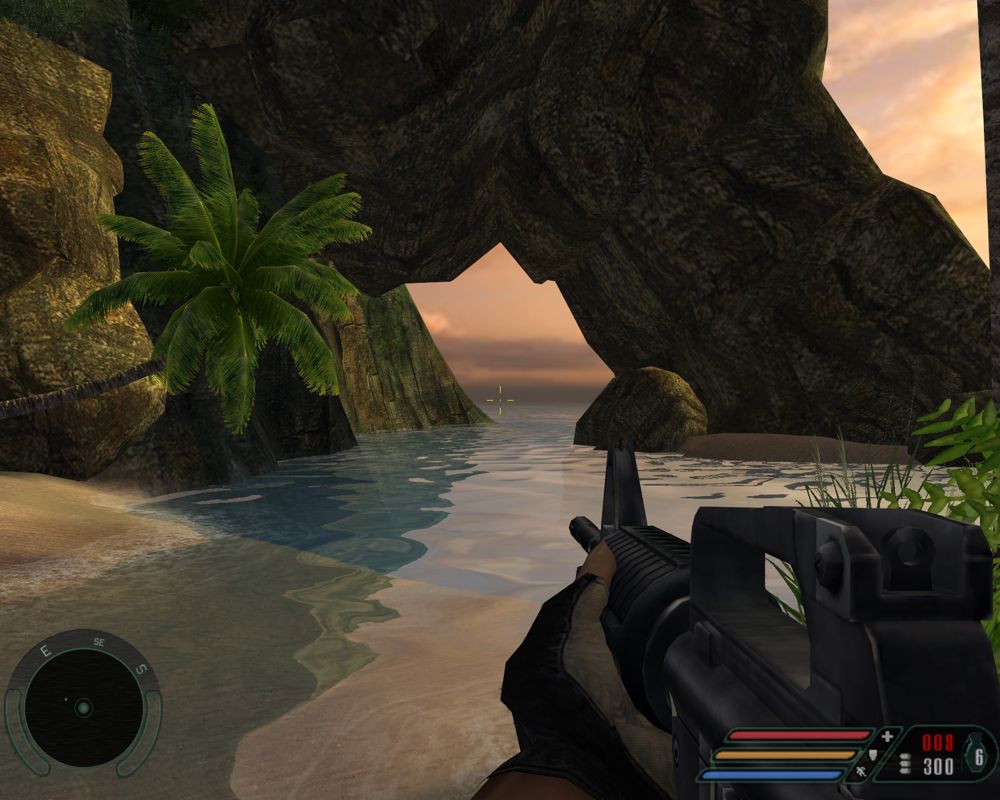
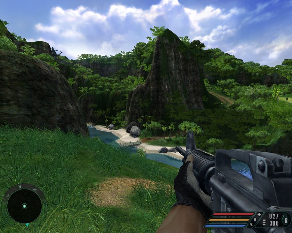
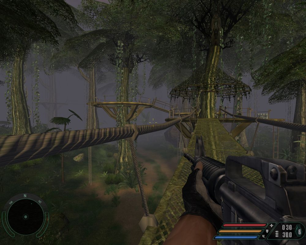
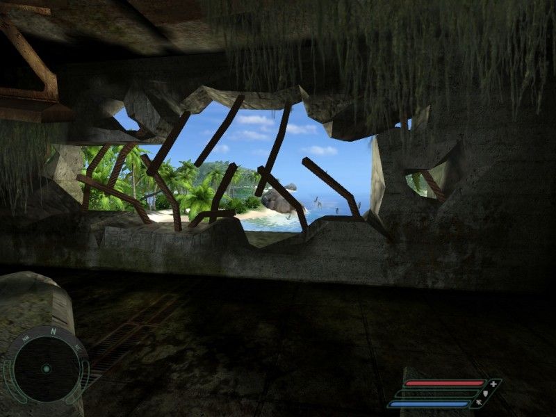
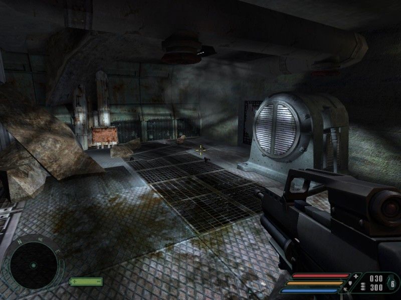
Sadly, onetime kingpin Far Cry's graphics simply don't excite me anymore. The aesthetic design was interesting enough, but leaned heavily on technical splendour for its lighting effects, draw distances and lush vegetation. These days, such things have all been bettered many times, and now it's hard not to notice how often plant models are repeated, or how the sunlight lancing through cracked walls just doesn't seem as bright as it once did (I've gained a new appreciation for High Dynamic Range since replaying Far Cry, that's for sure). Far Cry is certainly not ugly - but the bits which interest me most now are the bombed-out husks and concrete bunkers, which for a game so heavily based around creeping through dense jungles, and hopping between paradise islands, seems like something of a failure. I happily acknowledge that we have Far Cry to thank for the quality of modern graphics, but ultimately it remains tied to its era much more than any other game I've discussed so far.
I now know I'm not alone in my stance that the rabid pursuit of better graphics is as much a curse as a boon; I signed up to the official Carmageddon: Reincarnation fan forum before losing my net, and when the developers asked what we wanted to see in the game, the majority view was that physics and content - rather than cutting edge visuals - need to be the primary foci during development. I'll refine that here. Graphics are important, as the most immediate and visceral connection we get with a game, and as a sales-driving element, but more than overall fidelity what graphics need is to suit the game. For example, Carmageddon doesn't need to be too concerned with peds having perfect musculature and swaying fabric, but it would benefit greatly from per-pixel lighting, neon signs reflecting realistically off grime, oil and twisted metal - a moody atmosphere is key to Carmageddon. Fabric and musculature are of great importance to The Sims on the other hand, but lighting isn't so important there. And in FIFA, I don't care about every line on Coloccini's face being perfectly modelled half as much as I care about his passes and strikes being as fluidly realistic as possible. Every blade of grass on the pitch being individually rendered is excellent if it means the ball bounces more believably, but if it's purely for show, I don't think it's a productive use of development time.
Of course, on top of all that, graphics need to be creatively engaging; the problem with Far Cry is that its aesthetic interest was too dependent on technical advancements alone. If Carmageddon: Reincarnation is evocatively dirty and worn, nails that near-present dystopia without becoming Blade Runner cyberpunk, and features at least a few cars that look like real machines which have been customised rather than pure fantasy creations, then I'm happy. Graphical genius is a bonus, not a requirement. And judging by the Carmageddon concept art released so far, I'm going to be very happy indeed.
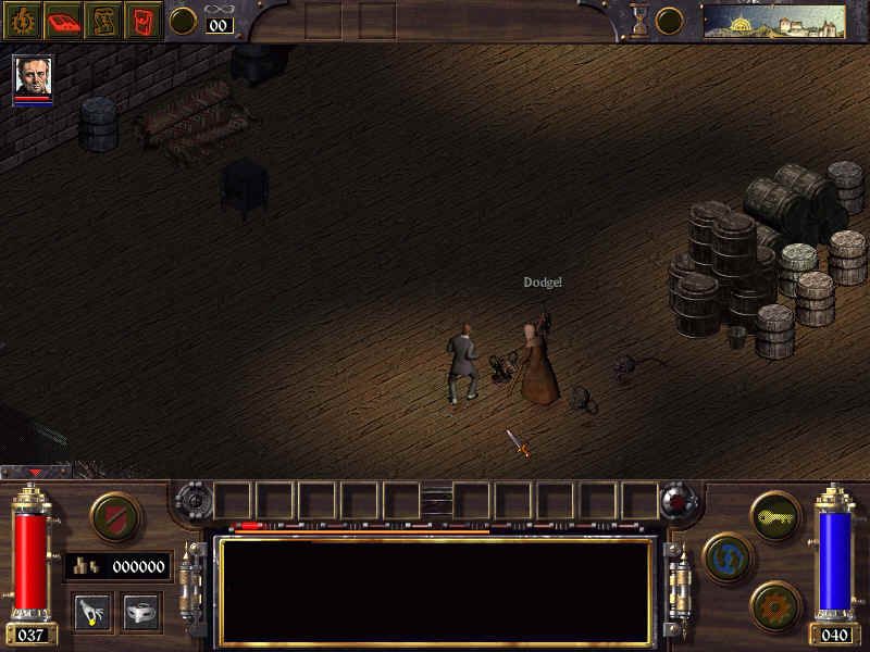
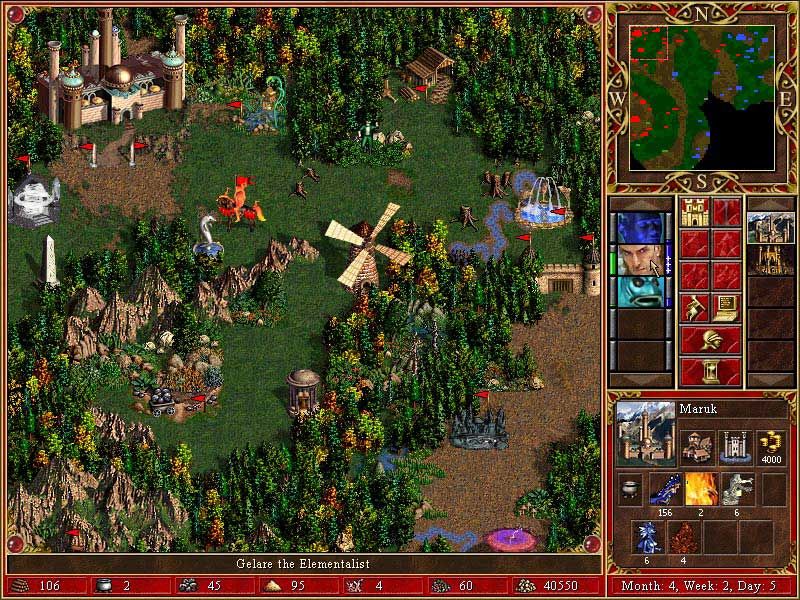
Some games were plain ugly first time round, of couse. A couple of titles I've come back to recently are Heroes of Might & Magic III and Arcanum: Of Steamworks & Magic Obscura. Each of those, on release, was widely decried for looking like a big pile of pixellated puke. Arcanum's spartan environments couldn't compete with Baldur's Gate 2, its closest contemporary - and yet today, I find something charming in Arcanum's stiff appearance. Its muddy grey scrubland, gleaming brass and starched petticoats may lack warmth, but that's in keeping with the cruel, repressed world in which it's set, and the faceless, rigidly mannequin-like character models are almost as appropriate as the old-fashioned maps and wood panel HUD. Heroes III takes the opposite tack, and tries to pack every screen with as many bright colours, outlandish creatures and incidental details as possible. It's a game bursting with life and humanity despite poor visuals - if anything, it's too cluttered, but then that was always the case, really. It remains a weird contrast to see stiff, jerky movements in sprites with such colourful, fantastical design, and these days they look rather like puppets or automatons. But even in development, 3DO must have known the game would not be breaking any technical barriers, and the upshot is that they designed a game which is functional enough to be as playable today as it was in 1999, and while not conventionally pretty, is at least interesting looking - call it the Agyness Deyn of strategy games.
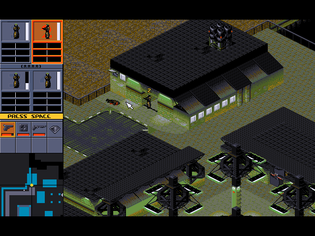
Syndicate, by contrast, has been a struggle to play nowadays. The graphics weren't terribly clear or engaging at the time, and now, it's difficult to know what's going on, and to distinguish your own squad from both the enemy and from civilians. It's still a good game, but requires a lot more perseverance than any other title I've mentioned. Not being able to see inside buildings when you enter them was a minor frustration back then; today, it's painfully out of step with how we expect to play games, and that's just one example of many issues it has. Syndicate's graphics are still fairly crisp, I'll give it that, and it was obviously made with a strong aesthetic in mind, but not enough thought was given to the necessities of gameplay. It stands a reminder that the balance between the technical and artistic is not the only one which must be struck.
The one vaguely recent PC game I got a chance to play in the winter months was the indie physics platformer NightSky, which is suprisingly entertaining. Much like Braid, NightSky hits a great equilibrium of visual elements. Technical proficiency means it runs smoothly while handling the physics puzzles, the aesthetic design is strikingly beautiful, and it's always clear and readable from a gameplay perspective. Compare that to Super Meat Boy which suffered from occasional lag or camera overshoot, to Alien Hominid and Viewtiful Joe, in which the gameplay elements weren't always distinguishable from the background, or to Limbo in which the main character was intentionally designed to look like part of the background.
Courtesy of Evis T and his portable gadgetry, I also had fun with the wonderful Android games Cut The Rope and Dragon, Fly!, which similarly match the visuals to the game effectively - both are a lot crisper than, say, Fruit Ninja or Burn The City, but Fruit Ninja's bright colours suit it more than cartoonish line drawings would, while Burn The City doesn't need to be especially clear because it's a bit more sedentary. It's not a new trend, of course; I've revistited a couple of indie games from a few years back like Ocular Ink, which is quite ugly but appropriately uncluttered for a fast paced game of drawing, and The White Chamber, which I'll talk about in more detail soon - for now, one thing I love about it is how subtly different the useable elements of the game world look from the non-useable. There's no need for tedious pixel sweeping. but at the same time, they don't stick out like a sore thumb, so you still have to pay attention, and for a point and click adventure that's one of the magic elements which can make a good game into a great game.
A cautionary tale to close this post, regarding picking up old games: I came back to Chrono Trigger after almost a year and had no idea how far through I was or what I was supposed to be doing. I left off my Secret of Mana playthrough even longer ago than that, and I expect I'll probably just need to start again.
On the subject of retro: I know I've said this before and I'm sure I'll say it again, but damn is that word irritating. Gamers of the world, I implore you to stop describing old games as retro! Around Christmas time I rewatched It's a Wonderful Life and it's not a 'retro' film. It's just a film. A film which, despite technical limitations in its production compared to modern releases, and the subsequent years' advancement of cinematic techniques and a shifting of the preconceptions of good storytelling, is still every bit as enjoyable as anything you'll see at the pictures this year.
Similarly, despite their technical ineptitude by modern standards, I've been thoroughly enjoying the Micro Machines, Donkey Kong Country and Sonic the Hedgehog series, and the original Grand Theft Auto has lost barely anything despite the advances of its successors. Even ancient Disney tie-in Aladdin was as playable today as it was in 1993. The original Donkey Kong Country is the most revealing game from a technological standpoint - can you believe it was once considered the cutting edge of photorealism? I wonder if the kids of today could even see the difference in quality between its graphics and those of Sonic 3, a difference which seemed so vast to us at the time. Nonetheless, the visuals do everything they need to do to make the game playable, while still looking charmingly pretty in a - sigh - 'retro' sort of way. Maybe the ice cave levels don't make me feel physically cold anymore, but the big Rareware eyes on all the enemies are still lovely.
Moving ahead a few years, the GameCube remake of Resident Evil is still stunningly beautiful, and not just in consideration of when it was released. It's both confirmed and countered my arguments against the pursuit of graphic fidelity - rendered stills are obviously a lot easier to make realistic than moving images are, and the near-realism of the backgrounds is a big part of the atmosphere. But at the same time, so much attention has been paid to the architecture, the furnishings, and even the drapery that the enhanced visuals are clearly not just a sales point - it's Shinji Mikami finally getting to make this world look the way it always did in his head. The Spencer Mansion and Arklay Laboratory feel like real places, places I know as well as any house I've actually, personally lived in.
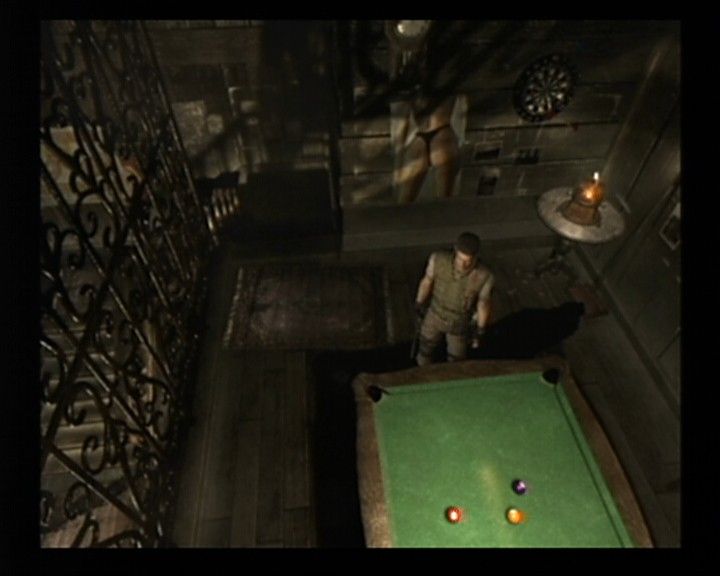
Of course improvements could be made - physics-based elements like water, particle effects and shadows are unimpressive by today's standards, ditto the resolution. But aside from such processing updates, and the plastic look to character faces which current games still suffer from anyway, it's hard to see where the graphics could be improved. It's a harmonious case of technological wizardry being applied by talented visual designers who maximise the artistic opportunities said wizardry affords, and the result means that a decade on it remains one of the best-looking games in existence. The most advanced thing I got to play during my fallow months was the PC demo of Arkham Asylum - no longer cutting edge, admittedly, but I will state without hyperbole that GameCube Resident Evil is the better looking game for all the jagged, pixelly edges and blocky shadows. That said, some areas of Arkham Asylum are moderately impressive in aesthetic design terms too, and it'll be interesting to see how it holds up in years to come. By the by, I was pleasantly surprised by how fluidly Arkham Asylum plays on PC - control-wise, it's just as smooth as the 360 version, perhaps even moreso. Having subsequently completed the game on PC, there were only a handful of places where I'd have preferred a pad.
Sadly, onetime kingpin Far Cry's graphics simply don't excite me anymore. The aesthetic design was interesting enough, but leaned heavily on technical splendour for its lighting effects, draw distances and lush vegetation. These days, such things have all been bettered many times, and now it's hard not to notice how often plant models are repeated, or how the sunlight lancing through cracked walls just doesn't seem as bright as it once did (I've gained a new appreciation for High Dynamic Range since replaying Far Cry, that's for sure). Far Cry is certainly not ugly - but the bits which interest me most now are the bombed-out husks and concrete bunkers, which for a game so heavily based around creeping through dense jungles, and hopping between paradise islands, seems like something of a failure. I happily acknowledge that we have Far Cry to thank for the quality of modern graphics, but ultimately it remains tied to its era much more than any other game I've discussed so far.
I now know I'm not alone in my stance that the rabid pursuit of better graphics is as much a curse as a boon; I signed up to the official Carmageddon: Reincarnation fan forum before losing my net, and when the developers asked what we wanted to see in the game, the majority view was that physics and content - rather than cutting edge visuals - need to be the primary foci during development. I'll refine that here. Graphics are important, as the most immediate and visceral connection we get with a game, and as a sales-driving element, but more than overall fidelity what graphics need is to suit the game. For example, Carmageddon doesn't need to be too concerned with peds having perfect musculature and swaying fabric, but it would benefit greatly from per-pixel lighting, neon signs reflecting realistically off grime, oil and twisted metal - a moody atmosphere is key to Carmageddon. Fabric and musculature are of great importance to The Sims on the other hand, but lighting isn't so important there. And in FIFA, I don't care about every line on Coloccini's face being perfectly modelled half as much as I care about his passes and strikes being as fluidly realistic as possible. Every blade of grass on the pitch being individually rendered is excellent if it means the ball bounces more believably, but if it's purely for show, I don't think it's a productive use of development time.
Of course, on top of all that, graphics need to be creatively engaging; the problem with Far Cry is that its aesthetic interest was too dependent on technical advancements alone. If Carmageddon: Reincarnation is evocatively dirty and worn, nails that near-present dystopia without becoming Blade Runner cyberpunk, and features at least a few cars that look like real machines which have been customised rather than pure fantasy creations, then I'm happy. Graphical genius is a bonus, not a requirement. And judging by the Carmageddon concept art released so far, I'm going to be very happy indeed.


Some games were plain ugly first time round, of couse. A couple of titles I've come back to recently are Heroes of Might & Magic III and Arcanum: Of Steamworks & Magic Obscura. Each of those, on release, was widely decried for looking like a big pile of pixellated puke. Arcanum's spartan environments couldn't compete with Baldur's Gate 2, its closest contemporary - and yet today, I find something charming in Arcanum's stiff appearance. Its muddy grey scrubland, gleaming brass and starched petticoats may lack warmth, but that's in keeping with the cruel, repressed world in which it's set, and the faceless, rigidly mannequin-like character models are almost as appropriate as the old-fashioned maps and wood panel HUD. Heroes III takes the opposite tack, and tries to pack every screen with as many bright colours, outlandish creatures and incidental details as possible. It's a game bursting with life and humanity despite poor visuals - if anything, it's too cluttered, but then that was always the case, really. It remains a weird contrast to see stiff, jerky movements in sprites with such colourful, fantastical design, and these days they look rather like puppets or automatons. But even in development, 3DO must have known the game would not be breaking any technical barriers, and the upshot is that they designed a game which is functional enough to be as playable today as it was in 1999, and while not conventionally pretty, is at least interesting looking - call it the Agyness Deyn of strategy games.
Syndicate, by contrast, has been a struggle to play nowadays. The graphics weren't terribly clear or engaging at the time, and now, it's difficult to know what's going on, and to distinguish your own squad from both the enemy and from civilians. It's still a good game, but requires a lot more perseverance than any other title I've mentioned. Not being able to see inside buildings when you enter them was a minor frustration back then; today, it's painfully out of step with how we expect to play games, and that's just one example of many issues it has. Syndicate's graphics are still fairly crisp, I'll give it that, and it was obviously made with a strong aesthetic in mind, but not enough thought was given to the necessities of gameplay. It stands a reminder that the balance between the technical and artistic is not the only one which must be struck.
The one vaguely recent PC game I got a chance to play in the winter months was the indie physics platformer NightSky, which is suprisingly entertaining. Much like Braid, NightSky hits a great equilibrium of visual elements. Technical proficiency means it runs smoothly while handling the physics puzzles, the aesthetic design is strikingly beautiful, and it's always clear and readable from a gameplay perspective. Compare that to Super Meat Boy which suffered from occasional lag or camera overshoot, to Alien Hominid and Viewtiful Joe, in which the gameplay elements weren't always distinguishable from the background, or to Limbo in which the main character was intentionally designed to look like part of the background.
Courtesy of Evis T and his portable gadgetry, I also had fun with the wonderful Android games Cut The Rope and Dragon, Fly!, which similarly match the visuals to the game effectively - both are a lot crisper than, say, Fruit Ninja or Burn The City, but Fruit Ninja's bright colours suit it more than cartoonish line drawings would, while Burn The City doesn't need to be especially clear because it's a bit more sedentary. It's not a new trend, of course; I've revistited a couple of indie games from a few years back like Ocular Ink, which is quite ugly but appropriately uncluttered for a fast paced game of drawing, and The White Chamber, which I'll talk about in more detail soon - for now, one thing I love about it is how subtly different the useable elements of the game world look from the non-useable. There's no need for tedious pixel sweeping. but at the same time, they don't stick out like a sore thumb, so you still have to pay attention, and for a point and click adventure that's one of the magic elements which can make a good game into a great game.
A cautionary tale to close this post, regarding picking up old games: I came back to Chrono Trigger after almost a year and had no idea how far through I was or what I was supposed to be doing. I left off my Secret of Mana playthrough even longer ago than that, and I expect I'll probably just need to start again.
Subscribe to:
Posts (Atom)